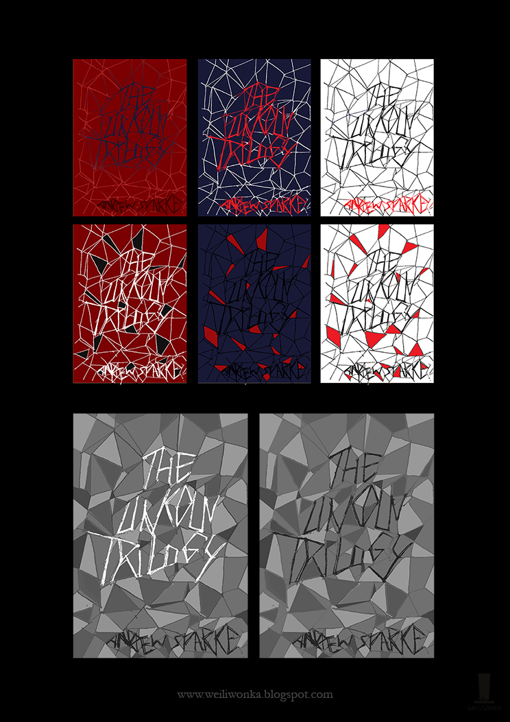
These are some thumbnails for my uni project (book cover) Each have a slightly different concept and approach for this novel trilogy.
Concept #1
For this one , I wanted to show the tense tone of the novel ( it has crime in it as well ) and showcase one of the core elements of this series which were the complicated , entangled relationships of each character. I tried it out as shards and fragments as well as a cobweb sort of feeling.
 |
| graphical style |
 |
| ink lines and flat tone |
For these are two sets of thumbnails, I used an image to represent each novel. money are ring for the first, rubber stamp for the second and an IV drip for the last. Each of these are core elements in the stories.
For the first set, I made them individual and not connected and the images done in a more graphical style.
Concept #2.5
The second set was done in one connecting line using a dip pen. I connected the title with the images to form one image altogether. This was done with the intention of showing how the story and the characters relationships are all in one way or another linked throughout the trilogy.
After speaking to the Author, He preferred the top right one from the concept #2.5 set.


No comments:
Post a Comment